

OVERVIEW
Context: Jeffery’s Toys is the oldest toy store in San Francisco. For this concept project, my challenge was to bring the store experience online by introducing e-commerce in the website redesign. I was given a project brief which discussed the business goals, and personas that highlighted user pain points and needs. The main goal was balance these needs, and make sure that Jeffery’s Toys new e-commerce doesn’t rob its users of the store experience.
Duration: 10 days
Tools: Pen, Pencil, Paper, Sketch and InVision
Deliverables: Lo-Fi Wireframe and User Flows
WORKFLOW
How I Spent the Ten Days

BUSINESS ANALYSIS & USER GOALS
Balancing The Goals
After carefully evaluating the business goals from the brief, and understanding the user needs and pain points from the personas, I was able to discover the following trends:
Users need easy ways to search and filter options
Users and Business wants to develop a sense of trust & brand
Users need a fast and seamless checkout process

CARD SORTING & IA
Defining The Structure
Through the help of multiple rounds of open and closed card sorting, I was able to define a structure of different categories with 100 products. The seven categories were:
Outdoor
Hobbies
Old is Gold
Pretend Play
Games
Learning
Collectibles

How might we bring the store experience online without losing the Jeffery’s Toys heritage?
I wanted the homepage to display information about the store’s heritage and have a plug for their featured products. I also decided to separate the e-commerce store as “SHOP” on the homepage navigation. The users can enter the e-commerce store after clicking on “SHOP”, and this way, their entire focus won’t be on the e-commerce story only.

Site Map: Blue indicates the e-commerce section of the website, and the Green shows different ways to encourage users to come to the actual store.
PERSONAS & USER FLOWS
Understanding Who I am Designing For
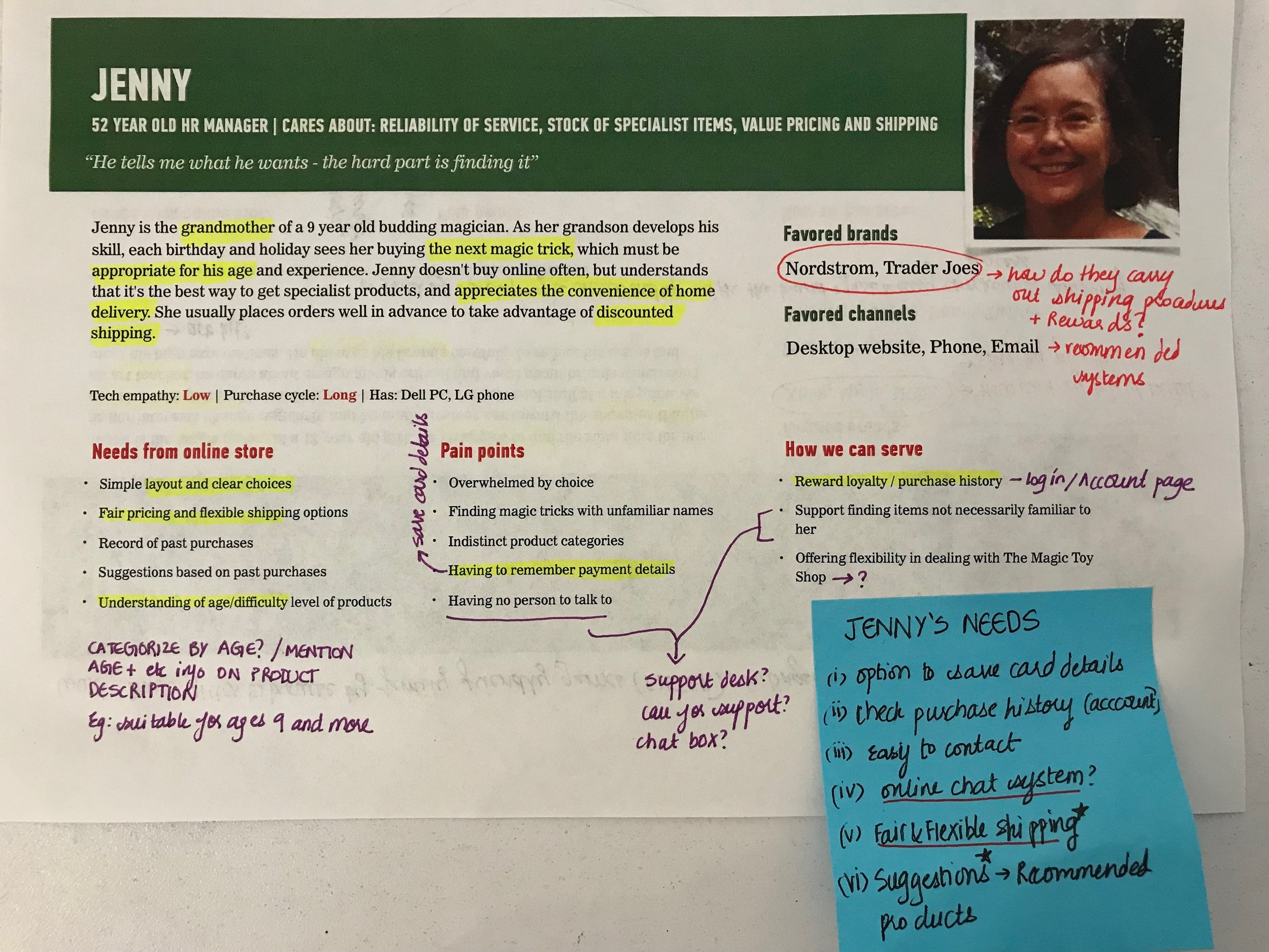
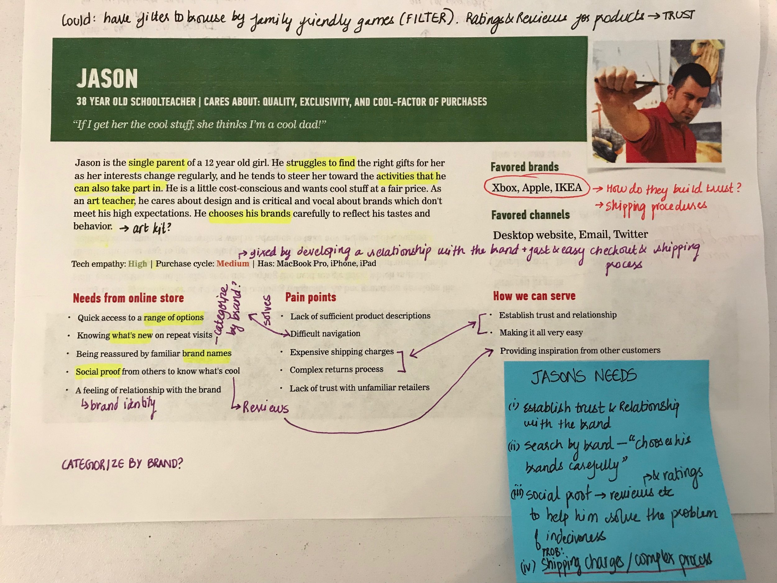
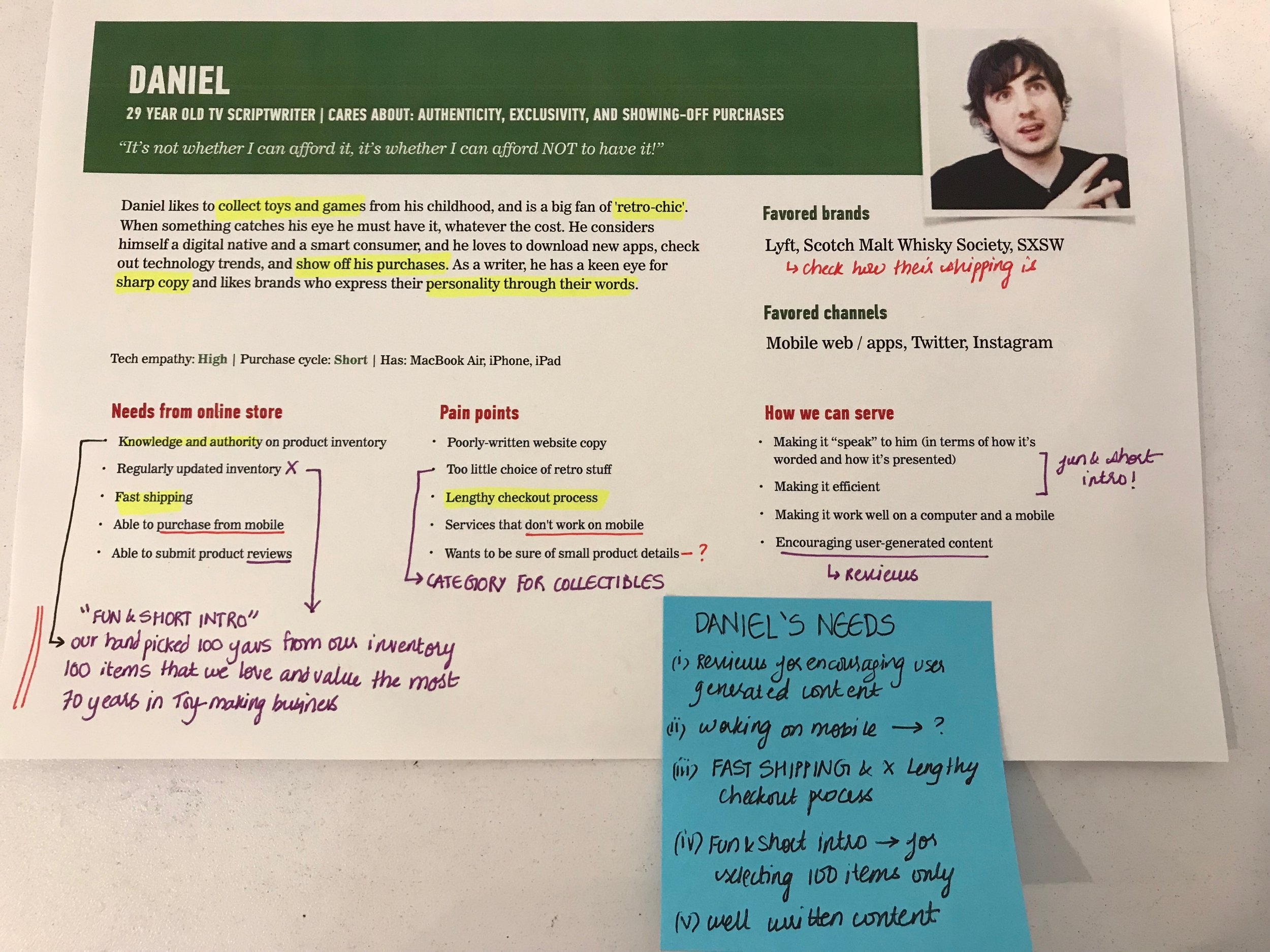
After figuring out the structure for 100 products, the next step was to understand what features and functions can be introduced in the redesign to aid user meet their goals. Synthesizing all of this helped me brainstorm and come up with the following possible features:
Filter for products
Faceted Navigation for age group, price (under $50 etc)
Wish list & Sharing function for product page
Saved shipping information for faster checkout process
Reviews/Add reviews
Gift recommendation
Help & Support
Understanding How I am Designing It
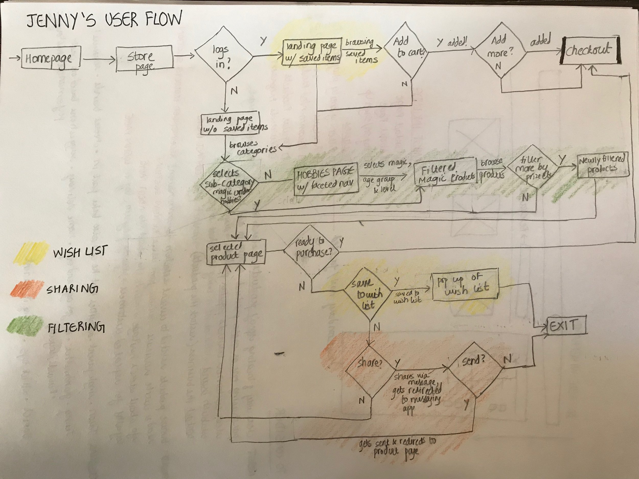
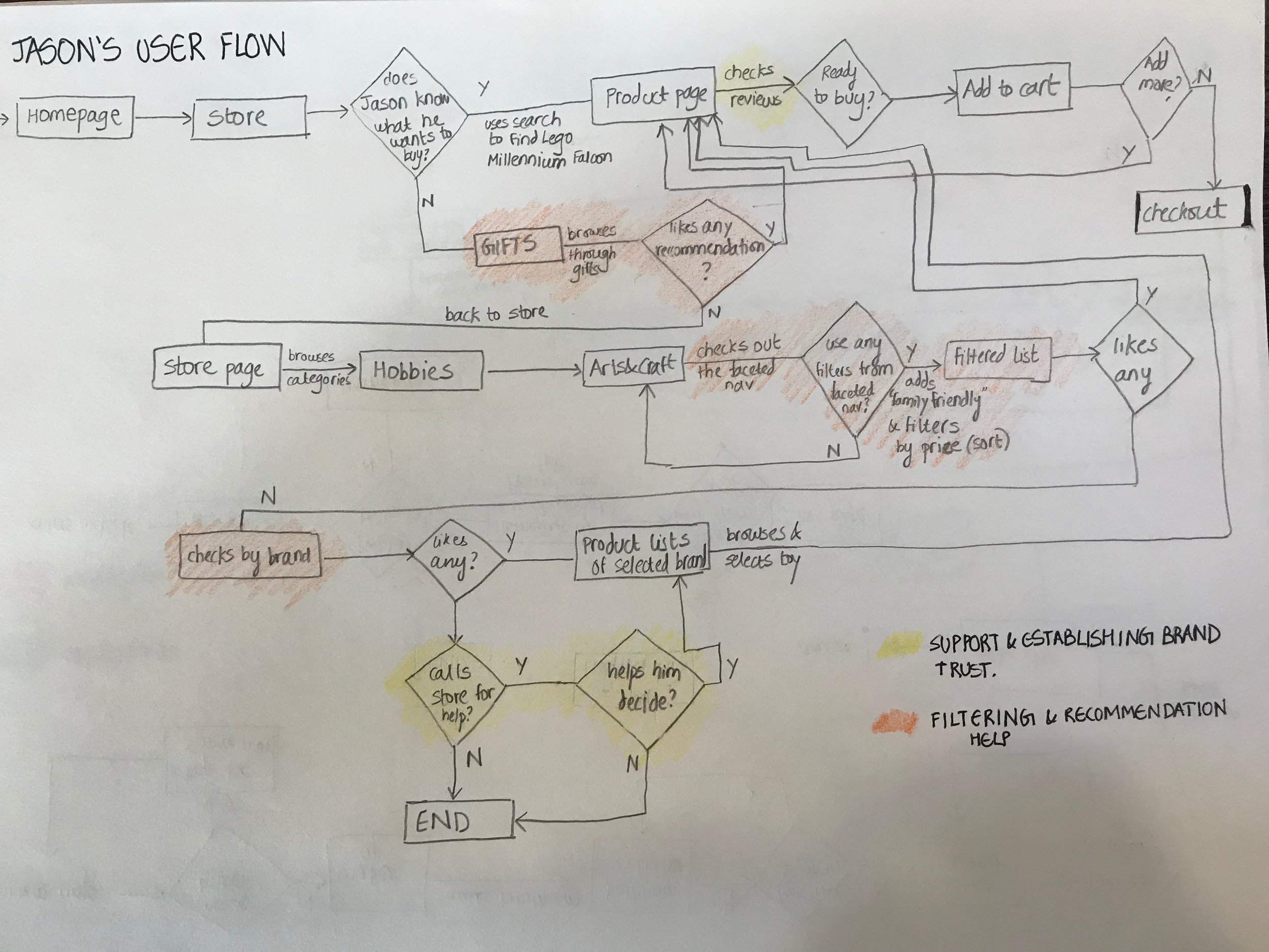
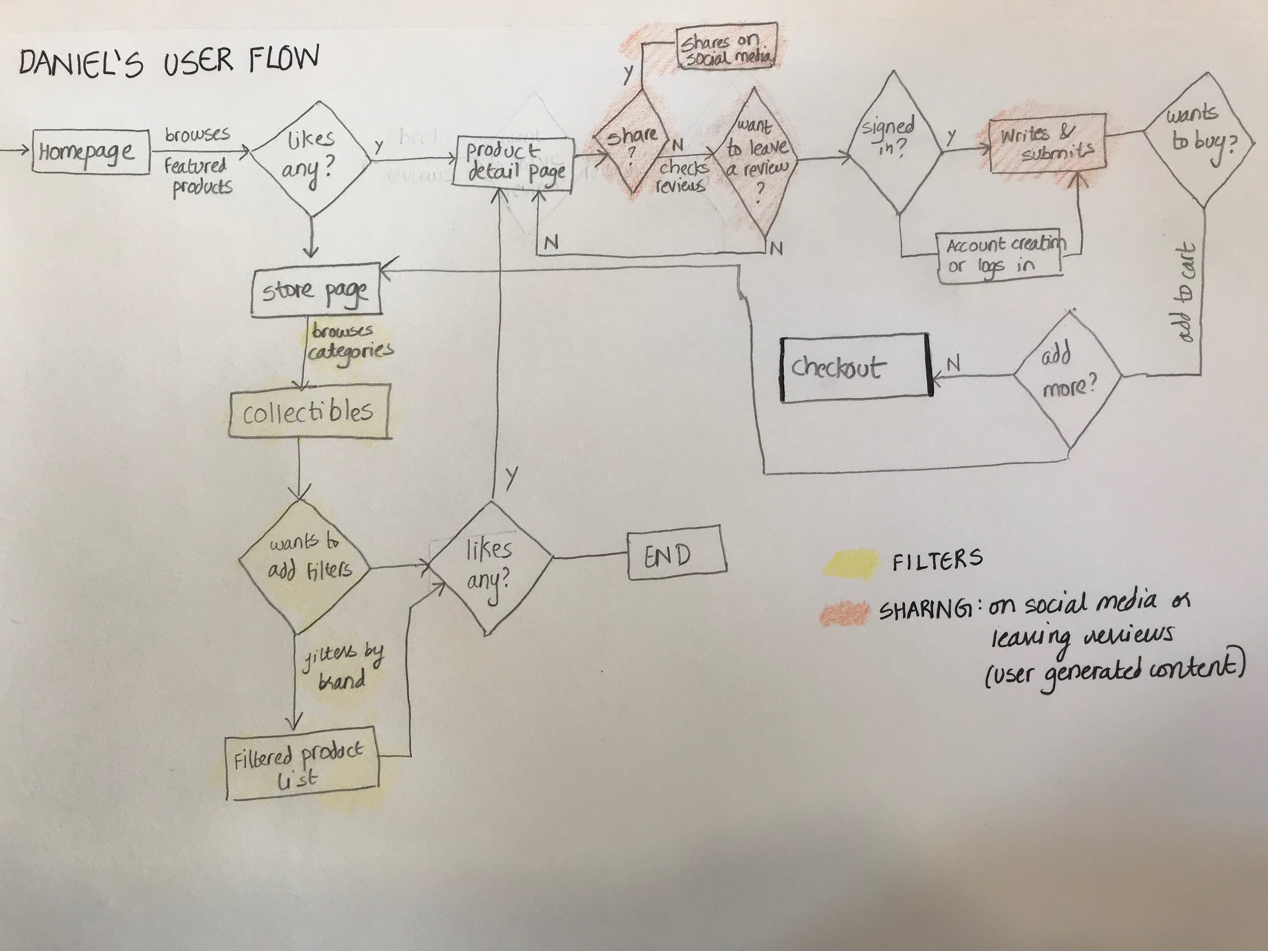
The user flow helped me inform how the wireframes were going to look. A good filter was the first priority since that came up in all the three personas. The main takeaway from the flows were:
Jenny: needs a wish list, sharing feature and filtering
Jason: needs recommendations, filtering, to establish trust in the brand
Daniel: needs sharing feature, filtering
DESIGN & ITERATE
For the first step of iteration, I drew out the following sketches for the wireframe and got feedback from 5 people. The overarching feedback I got was to include login in the global navigation for consistency.
The next step was to make wireframes and test it out with people. After doing usability testing with two people, and getting a positive feedback, I was able to make the final prototype of the proposed solution.

